Geo-routed Distance Calculator. Implementing Python and JavaScript in parallel for web-based GIS

By Ryan Freed, Bobby Basnet, Milad Korde

Background:

In the previous three posts on Distance Calculation Series, we tried a few approaches to deal with the straight-line distance between two points. Here are the links to the articles in order of appearance:

LINK 1, LINK 2, LINK 3

We invite you to read and try the previous programs we wrote to understand better this part of the project.

This post discovers the network distance between two points instead of the direct line. It is unlikely to search for the distance between two points and stick to a straight line to get from point A to point B unless you are in the middle of a vast area with no network of streets that can be considered for transportation. However, our attempt uses an external API instead of a network of roads created on our side.

Needed library:

There are two newly used libraries at the beginning of the Python script you need to call in. We briefly introduced Pyodide previously. Next, we want to catch your attention to the pyfetch class to call external APIs and asyncio to write asynchronous code using the async/await syntax. The response is contained in the response variable, where we implement the API key.

API Call:

The API we are calling is coming from Openrouteservice.org. Openrouteservice’s directions can be used all around the globe. It includes route instructions for cars, trucks, different bike profiles, walking, hiking, or wheelchair, and many more transportation-related services.

Configuring the output:

The form to read Pyscript content is hidden from the previous code version. The placeholders are also removed from all four styles for pairs of lat and long.

We also removed the variable to add the polyline because drawing a straight line between two points while we are trying to calculate the network distance based on the streets and roads does not make sense. However, we are planning to implement that too.

Event Listener:

Regarding the Event Listener, we have changed the approach. If there is a marker, which means that the user has already started the process, we show a message on the lower left corner of the map guiding the user to choose the second point. In the other part, we push the origin point if not selected.

The first API call attempt returns a dictionary with all the attributes. The information, however, is cut to the points along the route. It is also possible to see all the points (coordinates) along the way by uncommenting pyscript.write(‘storage’, route). The result of the route containing all the points along the way is stored in the storage div. right before the section where we start Python and PyScript.

Then we needed to pass all of this into a button click event to run the API call and store the response, done by the setup function in PyScript that executes after a PyScript asynchronous button click function.

JavaScript:

<script>
        //variable to store clicked coordinates
        let lat1, lng1, lat2, lng2;
        //Flag to check if origin or destination
        let origin = 0;
        //Array for points along the way
        let latlngs = Array();


        //Add the basemap
        let map = L.map('map').setView([42.282280316412546, -71.80865838018761], 13);
        //Points along the route
        let routePoint = L.featureGroup().addTo(map);
        L.tileLayer('https://tile.openstreetmap.org/{z}/{x}/{y}.png', {
            maxZoom: 19,
            attribution: '© OpenStreetMap'
        }).addTo(map);

        // function to draw marker on map
        function drawToMap(ev, what) { 
            let marker = L.marker([ev.latlng.lat, ev.latlng.lng]).addTo(routePoint);
        }

        // function to clear the map
        function clearMap() { 
            latlngs = Array()
            routePoint.clearLayers();
        }

        map.addEventListener('click', function(ev) { 
            if (origin == 0) { 
                clearMap()

                // if there is already a marker on the map, do the following
                document.getElementById('status').textContent= "Select Destination on The Map"
                document.getElementById('FirstLat').value = ev.latlng.lat
                document.getElementById('FirstLong').value = ev.latlng.lng


                latlngs.push([ev.latlng.lat,ev.latlng.lng]);

                drawToMap(ev, "Starting Position");

                origin = 1;
                }

            else {

                // if there is no marker, push these elements
                document.getElementById('status').textContent= "Select Origin on The Map"
                document.getElementById('SecLat').value = ev.latlng.lat
                document.getElementById('SecLong').value = ev.latlng.lng

                latlngs.push([ev.latlng.lat,ev.latlng.lng]);

                // manually force button click event to activate PyScript on-click listener
                let manual_event = document.getElementById('button');
                manual_event.click();

                drawToMap(ev, "Destination Point");

                latlngs.push([ev.latlng.lat, ev.latlng.lng]);
                let marker = L.marker([ev.latlng.lat, ev.latlng.lng]).addTo(route_polyline);
                
                origin = 0
                }
        });
    </script>

The georoute calculation:

After the API grabbed the points along the route, a Haversine formula on each lat-long pair in the 2D route array converts the degree values to radians to return a georouted distance in kilometers. Then the Haversine results and the sum of the differences produced the final calculation printed on the screen.

The PyScript section will be as follows:

<py-script output = 'storage'>

from pyodide.http import pyfetch
from js import document, alert
from pyodide import create_proxy
import asyncio
from math import radians, cos, sin, asin, sqrt


def haversine(lon1, lat1, lon2, lat2):
"""
Calculate the great circle distance in kilometers between two points
on the earth (specified in decimal degrees)
"""
# convert decimal degrees to radians
lon1, lat1, lon2, lat2 = map(radians, [lon1, lat1, lon2, lat2])

# haversine formula
dlon = lon2 - lon1
dlat = lat2 - lat1
a = sin(dlat/2)**2 + cos(lat1) * cos(lat2) * sin(dlon/2)**2
c = 2 * asin(sqrt(a))
r = 6371 # Radius of earth in kilometers
return c * r

async def button_click(event):
FirstLat = document.getElementById("FirstLat").value
FirstLong = document.getElementById('FirstLong').value
SecLat = document.getElementById('SecLat').value
SecLong = document.getElementById('SecLong').value

route = []

headers = {
'Accept': 'application/json, application/geo+json, application/gpx+xml, img/png; charset=utf-8',
}

response = await pyfetch(url=f"https://api.openrouteservice.org/v2/directions/driving-car?api_key=5b3ce3597851110001cf62487621a9df4b6a49cdbc6f26847723515b&start={FirstLong},{FirstLat}&end={SecLong},{SecLat}", method="GET", headers=headers)
response_dict = await response.json()

# create coordinates object, append it to the coords list for export to javascript
coordinates = response_dict['features'][0]['geometry']['coordinates']
route.extend(coordinates)
route.insert(0, [float(FirstLong), float(FirstLat)])
route.append([float(SecLong), float(SecLat)])

#lon1, lat1, lon2, lat2
route_diffs = []

for i in route: # switch from LongLat to LatLong
i[0], i[1] = i[1], i[0]

for i in range(len(route)): # need to use range len idiom (bad practice) to grab next index value without using itertools
try: # pairwise calculation of lat longs in georoute
lat1 = route[i][0]
lon1 = route[i][1]
lat2 = route[i + 1][0]
lon2 = route[i + 1][1]
difference = haversine(lon1 = lon1, lat1 = lat1, lon2 = lon2, lat2= lat2)
route_diffs.append(difference)
except IndexError:
break

finaldist = sum(route_diffs)

# Uncomment this if you would like to see the full route lat long array printed
#pyscript.write('storage', route)

pyscript.write('distance', f'<b>Distance from A to B:</b> {finaldist:.2f} km')

def setup():
"""
Initializes site content and HTML listeners that are typically handled by JavaScript
"""
click_proxy = create_proxy(button_click)

e = document.getElementById("button")
e.addEventListener("click", click_proxy)

setup()

</py-script>

Conclusion:

The main takeaway from this project is that PyScript is great for performing computations that are otherwise tedious in JavaScript. Still, the functionality is not yet there to do full visualizations inside of PyScript. The cartography itself is best done inside the JS environment as of right now.

We used API calls in the PyScript environment, then passed that information to the JavaScript environment without messing with the global namespace (which is, unfortunately, really buggy right now in PyScript).

GitHub Repo: LINK

First Impression on PyScript Through the Eyes of GIS! Distance Calculation!

Milad Korde and Bobby Basnet

Prerequisites:

Advanced knowledge of HTML, Advanced knowledge of JavaScript, Intermediate knowledge of GitHub, Intermediate knowledge of GIS

https://github.com/Milad84/PyScript-and-Distance-Calculation

You have been using JavaScript for a while and always wished to use Python instead? I feel you! PyScript is the answer. Not that this is the only answer but in my opinion one of the best ones!

My first exposure to web development in Python 3 was when I learned about CherryPy! CherryPy is written in Python, and components that deliver dynamic content are written as Python classes tightly integrated with CherryPy’s core. CherryPy is actively developed and enjoys a large user community. But this post is not about CherryPy! It is about PyScript!

PyScript is a framework that allows users to create rich Python applications in the browser using HTML’s interface and the power of PyodideWASM, and modern web technologies. The PyScript framework provides users at every experience level with access to an expressive, easy-to-learn programming language with countless applications.

Let’s see how you can use it in its simplest format coming directly from the PyScript.net:

<html>|


    <py-script> print('Now you can!') </py-script>|

</html>|

The first thing catching the eye is the <py-script> tag replacing the famous <script> as JavaScript enabler. You need to put your Python code between <py-script> and </py-script>. Following is a simple converter for grades based on a certain range. This is similar to what you see in learning systems such as CANVAS or Moodle, where the instructor sets rules to convert percentages or grades to letters that will appear on your transcript.


<html>
<head>
    <meta charset="UTF-8">
    <meta name="viewport"
          content="width=device-width, user-scalable=no, initial-scale=1.0, maximum-scale=1.0, minimum-scale=1.0">
    <meta http-equiv="X-UA-Compatible" content="ie=edge">
    <title>Document</title>
    <link rel="stylesheet" href="https://pyscript.net/alpha/pyscript.css" />
    https://pyscript.net/alpha/pyscript.js

    
</head>
<body>
   <center> <h1>Simple usage of PyScript</h1> </center>
    <center> 
    <div id="convert" align="text-center"></div>
    <py-script output="convert"> 

lst = [65,78,89,73,67,90,96,67,87,78]

for i in lst:
    if i >=50 and i <= 60:
        print ("F")
    elif i >=61 and i <= 70:
        print ("D")
    elif i >=71 and i  <=80:
        print ("C")
    elif i >=81 and i <=90:
        print("B")
    else:
        print ("A")

    </py-script>
    </center>
</body>
</html>

We will take this to another level. A GIS level. We want to improve the code and HTML at the same time. Our intention is to write an application that can take care of distance calculation. Our distance calculation is based on a simple cartesian coordinate system. So, for now, no curvature of the earth is included. We start with a semi-hard coded version. It means you still ask for a user input but in a very ugly way. Upon running the page, you will be asked to insert a value. No help! No suggestion. No message that can help you understand what to do! You have to insert the x1,y1,x2, and y2 in an orderly fashion to make the code calculate the distance between those two points:

File’s name on GitHub: 02_Distance.html

<html>
<head>
    <meta charset="UTF-8">
    <meta name="viewport"
          content="width=device-width, user-scalable=no, initial-scale=1.0, maximum-scale=1.0, minimum-scale=1.0">
    <meta http-equiv="X-UA-Compatible" content="ie=edge">
    <title>Document</title>
    <link rel="stylesheet" href="https://pyscript.net/alpha/pyscript.css" />
    https://pyscript.net/alpha/pyscript.js

    <py-env>
      
    </py-env>
</head>
<body>
    <h1>Distance Calculator</h1>

    <div id="Distance"></div>

<p></p>  

    <py-script output="Distance"> 
        
x1= int(input("What is the longitude of the first point"))
y1= int(input("What is the latitude of the first point"))
x2= int(input("What is the longitude of the second point"))
y2= int(input("What is the latitude of the first point"))

def distance(x1, y1, x2, y2):
    dx = x2 - x1
    dy = y2 - y1
    dsquared = dx*dx + dy*dy
    result = dsquared**0.5
    return result

r = distance(x1,y1, x2, y2)

print (r)
 

    </py-script>
</body>
</html>

We are trying to improve your python writing and HTML management simultaneously. Getting 4 values separately and an HTML pop-up message is painful and brutal. So let’s take care of that:

File’s name on GitHub: 03_Distance with list input.html

<!DOCTYPE html>
<html lang="en">
<head>
  
      <title> Distance Calculator </title>
    
    <!-- Pyscript -->
    https://pyscript.net/alpha/pyscript.js
    <!--<link rel="stylesheet" href="https://pyscript.net/alpha/pyscript.css" />-->
    
    <!-- bootstrap for styling , Pyscript can also be used for styling instead of bootstrap -->
    https://code.jquery.com/jquery-3.6.0.min.js 
    <link rel="stylesheet" href="https://stackpath.bootstrapcdn.com/bootstrap/4.5.0/css/bootstrap.min.css" integrity="sha384-9aIt2nRpC12Uk9gS9baDl411NQApFmC26EwAOH8WgZl5MYYxFfc+NcPb1dKGj7Sk" crossorigin="anonymous" />
    https://stackpath.bootstrapcdn.com/bootstrap/4.5.0/js/bootstrap.min.js
    <style>
    
    body {
        background-color: #fcfcfc;
        padding-top: 55px;
        min-height: 100vh;
        margin:0;
        display:flex;
        flex-direction:column;
      }
    </style> 

</head>
<body>


 <div id="distance"></div>

<p></p>  

<py-script> 

from js import document,alert

x1,y1, x2,y2 = [float(x) for x in input("Enter 4 values with a space between them: ").split()]


def distance(x1,y1,x2,y2):
    dx = x2 - x1
    dy = y2 - y1
    dsquared = dx*dx + dy*dy
    calculated_distance = dsquared**0.5
    return calculated_distance

result = distance(x1,y1,x2,y2)

#print ("The distance between two points is", result)

pyscript.write("The Distnce is",result)


</py-script>


    <div class="container">
        <br>
        <br>
        <br>
        <br>
        <br>
        <h1 class="text-center">
            Insert coordinates of your chosen two points with a space between every value to calculate the distance. </h1>
            <br>
           <p align="center"> Example: 23.52 45.2 24 67.08 </p>
        
        <br />

       <!--  <p><h3>Enter the coordinates</h3>
        <input id="x1,y1, x2,y2" type="text" class="form-control" aria-label="Large" aria-describedby="inputGroup-sizing-sm" placeholder="Enter the Latitude of the first point" /></p> -->


       <!--  <center>
            <button id="distance" type="submit"  class="btn btn-info" pys-onClick="distance">Calculate the Distance Between Two Points</button>

        </center> -->
        
        <p>
        <h4>Result:</h4>
        <textarea id="The Distnce is" class="form-control" rows="2" aria-label="Large" aria-describedby="inputGroup-sizing-sm" placeholder="Result"></textarea></p>
    
        
    </div>    

</body>
</html>

Is it possible to improve it? The answer is yes. So what we imagine is a web-based app that can ask for inputs (coordinates) and returns the result of the calculation:

To achieve this, we need to take care of a few things:

  1. The proxy that is going to take care of the event handler. In this case, I have a button (Calculate the Distance Between two Points) that will trigger the function on click and show the result in the Result box. To achieve that, I will use create_proxy from the PyoDide library.
  2. I also have a result box that should receive the result upon the click on the button:

document.getElementById("Distance").innerHTML = 'Calculated Distance: ' + str(calculated_distance)

3. The second function is set to create the proxy itself and create a JavaScript Proxy.

File’s name on Github: 04_Distance Calculator.html

from js import document, alert
#imported this to create a proxy function that will not execute when the page is loaded
from pyodide import create_proxy
 
 
def button_click(event):
	
	
	FirstLat = document.getElementById("FirstLat").value
	FirstLong= document.getElementById('FirstLong').value
	SecLat= document.getElementById('SecLat').value
	SecLong= document.getElementById('SecLong').value
	
	
	<!-- #validate input
	if(not(FirstLat.isnumeric()) and not(FirstLong.isnumeric()) and not(SecLat.isnumeric()) and not(SecLong.isnumeric())):
		alert("Invalid Input(s), please make sure you have valid cordinates input")
		return False -->
	
			
	#since the input values will be string, convert to float
	dx = float(SecLat) - float(FirstLat)
	dy = float(SecLong) - float(FirstLong)
	dsquared = dx*dx + dy*dy
	calculated_distance = dsquared**0.5
 
	
	document.getElementById("Distance").innerHTML = 'Calculated Distance: ' + str(calculated_distance)

 
def setup():
	# The page is ready, clear the "page loading"
	document.getElementById("msg").innerHTML = ''
 
	# Create a JsProxy for the callback function
	click_proxy = create_proxy(button_click)
 
	# Set the listener to the callback
	e = document.getElementById("button")
	e.addEventListener("click", click_proxy)
 
setup()

As you may notice, I have commented out the validation part with an HTML toggle comment because I know I will use the code in an HTML file. Also, you may ask why we are validating if we do not include it. Some of you may want to use it for other kinds of use. Then you can use the validation strategy. In our case, and specifically in the case of distance calculation based on a Cartesian coordinate system, you will have negative numbers: Western hemisphere, for example! If you put the verification in the act, you will have problems. Please try it yourself!

Comparing Multiple Fields From a Table to One Single Field in the Same Table – In ArcPro and in Python

Prerequisites: Intermediate Python, Intermediate ArcGIS Pro

Previously I had written a post regarding the calculation of a field based on another field here. However, the old post was based on comparing only two fields. In simple words, what I was trying to find consisted of populating a newly created field just by looking at the content of another field in the same table.

In this post, I want to take a step further and compare more than 1 field. The idea comes from a question that one of my friends asked, which tries to determine the contamination in samples based on a reference value:

“How can I determine if 50% of all the variables (field in GIS) that I have in a table are bigger than the reference variable?”

The same question can be formulated in another way:

“How can I determine if the reference variable is smaller than 50% of all the variables ?”

Not Clear? I feel you! I felt the same the very first time I was asked the question. So let’s take a look at the table and make it easier (hopefully):

So what I want to do is to determine whether the majority of values stored in RD1,RD2,RD3,RD4,RD5,RD6,RD7,SH1, and Site 11 are bigger than the result stored in the field called Blank for each row. Notice that I am not showing all the fields because I am interested in 50% of them, and it does not matter which one should be included. Therefore I am choosing the first 9 appearing in the above picture. This brings another point: we have 18 variables, excluding “Blank.” So if I find 9 values in a row where the number is bigger than the value stored in Blank, then I want that row to be kept in the table, and if the opposite happens, I want that record (row) to be removed from the table!

If it was a matter of comparison between two variables, it would have been possible to solve by introducing two parameters (arguments) in a def like I did in this post! But here, we have more variables, and to compare them to each other, I need to get some help from Python. That help comes from *argument.

I name my function as defcom and introduce variables into it:

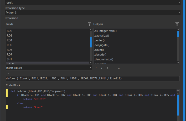
defcom (!Blank!,!RD1!,!RD2!, !RD3!,!RD4!, !RD5!, !RD6!,!RD7!, !SH1!,!Site11!)

Compare Fields Example_Seif

Next, I use the Code Block in calculate field to call the function:

def defcom (Blank,RD1,RD2,*argument):
    if Blank >= RD1 and Blank >= RD2 and Blank >= RD3 and Blank >= RD4 and Blank >= RD5 and Blank >= RD5 and Blank >= RD6 and Blank >= RD7 and Blank >= SH1 and Blank >= Site11 :
        return "delete"
    else:
        return "keep"

In this way, I can avoid repeating all the variables as arguments when I define my function and just use them to do the if statement and/or call them whenever I want to call them.

The above code written in the Calculate Field will produce a new field (column) and will assign “delete” or “keep” based on the outcome of the if statement. In this way, I know which “records” (rows) can be kept or deleted and eventually answer the question we asked at the beginning of the post.

In Python

But what if you want to try this in Python? I will make this a little bit easier by introducing a variable for every field that we might have in our imaginary table. So that our (imaginary) table is composed of a header and one row:

Blank= 0.5 RD1= 0.3 RD2= 0.2 RD3= 0.2 RD4= 0.6 RD5= 0.7 RD6= 0.6 RD7= 0.9 SH1= 0.2 Site11= 0.6

This might not be efficient, but I think it might be better for educational purposes. In addition, you can copy and paste it into your text editor to see the result, play with it, change it, etc. The same variables can be introduced in a list or tuple or simply called from a data frame, but we now stick to each field’s single variable and value.

After setting variables, we replicate the same concept. The only things that have changed are that I am using *args instead of *arguments and putting variables inside parenthesis for if statement:

Blank= 0.5
RD1= 0.3
RD2= 0.2
RD3= 0.2
RD4= 0.6
RD5= 0.7
RD6= 0.6
RD7= 0.9
SH1= 0.2
Site11= 0.6


def defcom (Blank,RD1,RD2,*args):
    if (Blank >= RD1 and Blank >= RD2 and Blank >= RD3 and Blank >= RD4 and
    Blank >= RD5 and Blank >= RD6 and Blank >= RD6 and Blank >= RD7 and
    Blank >= SH1 and Blank >= Site11) :
        return ("delete")
    else:
        return ("keep")

e= defcom(Blank,RD1,RD2)

print (e)

A good exercise would be to run through a for loop for a real table so the code can decide whether to keep the row or not! Next time!

What Tutorials Will Not Tell You on Geostatistical Predicted Surfaces! In R and ArcGIS Pro! Part 4- (Semi)Variogram, Error and Final Assessment!

6. Next, we want to fit a variogram model to the binned data and add it to our graph. For this, you’ll need to select the sill (“psill”), nugget, and range values appropriately or the curve may not appear on the graph. Let’s take a look at the components of variogram:

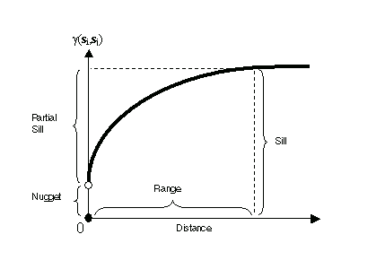
Typical semivariogram
Figure 1a. Components of a variogram

image\Variogram.gif
Figure 1b. Variogram

When you look at the model of a semivariogram, you’ll notice that at a certain distance, the model levels out. The distance where the model first flattens out is known as the range. The value that the semivariogram model attains at the range (the value on the y-axis) is called the sill. The partial sill is the sill minus the nugget. Theoretically, at zero separation distance (lag = 0), the semivariogram value is 0. However, at a small separation distance, the semivariogram often exhibits a nugget effect, which is some value greater than 0. For example, if the semivariogram model intercepts the y-axis at 2, then the nugget is 2.

The nugget effect can be attributed to measurement errors or spatial sources of variation at distances smaller than the sampling interval or both. Measurement error occurs because of the error inherent in measuring devices. Natural phenomena can vary spatially over a range of scales. Variation at microscales smaller than the sampling distances will appear as part of the nugget effect. Before collecting data, it is important to gain some understanding of the scales of spatial variation.

The general formula for creating the variogram is:

γ(si,sj) = ½ var(Z(si) - Z(sj))

If two locations, si and sj, are close to each other in terms of the distance measure of d(si, sj), you expect them to be similar, so the difference in their values, Z(si) – Z(sj), will be small. As si and sj get farther apart, they become less similar, so the difference in their values, Z(si) – Z(sj), will become larger. This can be seen in the above figure, which shows the anatomy of a typical semivariogram.

Covariance function

The covariance function is defined to be

C(si, sj) = cov(Z(si), Z(sj)),

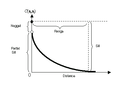
Covariance is a scaled version of correlation. So, when two locations, si and sj, are close to each other, you expect them to be similar, and their covariance (a correlation) will be large. As si and sj get farther apart, they become less similar, and their covariance becomes zero. This can be seen in the following figure, which shows the anatomy of a typical covariance function.

Typical covariance function
Figure 2. Covariance

Notice that the covariance function decreases with distance, so it can be thought of as a similarity function.

Relationship between semivariogram and covariance function

There is a relationship between the semivariogram and the covariance function:

 γ(si, sj) = sill - C(si, sj),

This relationship can be seen in the figures. Because of this equivalence, you can perform prediction in Geostatistical Analyst using either function. (All semivariograms in Geostatistical Analyst have sills.)

Semivariograms and covariances cannot be just any function. For the predictions to have nonnegative kriging standard errors, only some functions may be used as semivariograms and covariances. Geostatistical Analyst offers several choices that are acceptable, and you can try different ones for your data. You can also have models that are made by adding several models together—this construction provides valid models, and you can add up to four of them in Geostatistical Analyst. There are some instances when semivariograms exist, but covariance functions do not. For example, there is a linear semivariogram, but it does not have a sill, and there is no corresponding covariance function. Only models with sills are used in Geostatistical Analyst. There are no hard-and-fast rules on choosing the “best” semivariogram model. You can look at your empirical semivariogram or covariance function and choose a model that looks appropriate. You can also use validation and cross-validation as a guide.

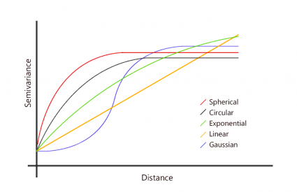
Once you’ve created the empirical semivariogram, you can fit a model to the points forming the empirical semivariogram. The modeling of a semivariogram is similar to fitting a least-squares line in regression analysis. Select a function to serve as your model, for example, a spherical type that rises at first and then levels off for larger distances beyond a certain range.

Let’s get back to the coding: The “model” can be one of the following:

  • “Exp” (for exponential)
  • “Sph” (for spherical)
  • “Gau” (for Gaussian)
  • “Mat” (for Matern)
  • Linear

kriging models
Figure 3.Different types of variogram models


After a lot of attempts I was able to get an acceptable model with the following parameters:

TheVariogramModel <- vgm(psill=45, ,model="EXP", nugget=0.01, range=0.5)
plot(TheVariogram, model=TheVariogramModel)

Figure 4. The fitted (almost) line to the variogram

Note that for random data there is very little autocorrelation so the range is very small and we reach the sill quickly. In Arcpro instead, the modeling process will take care of setting the parameters which makes it easier to run but less appealing to understand what is happening.

would you like to know how a spatially correlated variable looks like? Take a look at the following figure:

Figure 5. A high spatially correlated variogram

Semivariograms are estimated for subsets of input points independently (the input data is first divided into overlapping subsets of a specified size (defaulted to 100 points per subset) and a spectrum of semivariograms is estimated for each subset. When spectrums are very different for different subsets, the process is not globally stationary, and the predictions made by EBK may be more accurate than the predictions from methods that require global stationery.

Figure 6. Subsets, Source: ESRI

The above graphic shows many pairs of locations, linked by blue lines that are approximately the same length and orientation. They have approximately the same spatial similarity (dependence), which provides statistical replication in a spatial setting so that prediction becomes possible.

Checking for nonstationarity using semivariograms in ArcPro

In spatial modeling of the semivariogram, you begin with a graph of the empirical semivariogram, computed as,

Semivariogram(distance h) = 0.5 * average [ (value at location ivalue at location j)2]

for all pairs of locations separated by distance h. The formula involves calculating half the difference squared between the values of the paired locations. To plot all pairs quickly becomes unmanageable. Instead of plotting each pair, the pairs are grouped into lag bins. For example, compute the average semivariance for all pairs of points that are greater than 40 meters but less than 50 meters apart. The empirical semivariogram is a graph of the averaged semivariogram values on the y-axis and distance (or lag) on the x-axis (see diagram below) accessible in ArcPro.

Semivariogram
Figure 7. The Empirical Semivariogram

The presence of large differences in the spectrums in different locations indicates global nonstationarity. Also, When empirical Bayesian kriging is performed in the Geostatistical Wizard, you are able to see the subsets that were used to calculate the predicted value.

Figure 8. Subsets of variograms and empirical variogram

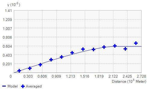
After you have created the empirical semivariogram, you can fit a line to the points to form the empirical semivariogram model. A number of semivariogram models can be employed, and different models may lead to different interpolations. Therefore, selecting an appropriate model to capture the features of the data is critical. The selected model influences the prediction of the unknown values, particularly when the shape of the curve near the origin differs significantly. The steeper the curve near the origin, the more influence the closest neighbors will have on the prediction.

The following graphic shows the Exponential model applied to sample data. This model is typically applied when spatial autocorrelation decreases exponentially with increasing distance, disappearing completely only at an infinite distance.


The following graphic shows the K-Bessel model (available with ArcPro) applied to sample data. This model is typically applied when most of the empirical covariances fall inside the confidence intervals and a few fall just outside the intervals.

But still, this model is not a good one:

Transformations are used to bring your data closer to a normal distribution and to satisfy stationarity assumptions (Refer to Part 1 where we discussed transformation and stationary).

When you apply K-Bessel in the General Properties, an additional graph for the Shape parameter appears. In addition, a new Transformation tab appears, which displays the distribution of the fitted transformations (one for each simulation). The transformation distribution is colored by density, and quantile lines are provided. The K-Bessel semivariogram is the most flexible and accurate, though it takes the longest to calculate. If you are willing to wait to get the most accurate results, K-Bessel is the best choice.

As you change parameters within the wizard, the preview map updates to reflect the new model parameters.

The Error?

The error graph displays the difference between the known values and their predictions. The ArcPro will calculate the error automatically in addition to the QQplot and the prediction.

The standardized error graph displays the error divided by the estimated errors. The standardized error equation is represented by the blue line. To assess the extent of error, each item is squared, and then the average of these squared errors is taken. This average is called the root mean square (or RMS).

Over the course of your geostatistical interpolation process, you will have created several prediction surfaces. Comparison helps you determine how good one model is relative to another. You can evaluate each model by determining which best meets the ideal statistical values based on the cross-validation statistics. With the Geostatistical Wizard, you can assess how parameters affect your data samples. Consider the following columns: measured (the measured value at a point ); predicted (the prediction at that point when it is removed from the input ); and error (the difference between the measured and predicted values). Because an over- or under-prediction can occur at any point, errors can be positive or negative.

You must consider two things when comparing the results from different methods: optimality and validity. For example, if a particular model has a small RMS prediction error, you might conclude that it is the optimal model. However, another model’s RMS prediction error may be closer to the average estimated prediction standard error. Therefore, the second model might be more valid because, when you predict at a point without data, you have only the estimated standard errors to assess your uncertainty of that prediction.

You must also check that the RMS standardized value is close to 1. When the RMS standardized value is close to 1 and the average estimated prediction standard errors are close to the RMS prediction errors from cross-validation, you can be confident that the model is appropriate.

The goal of comparison is to end up with a prediction surface with the following qualities:

  • Unbiased (centered on the true values)
  • Standardized mean prediction errors near 0
  • Valid prediction standard errors
  • Small RMS prediction errors
  • Average standard error near RMS prediction errors
  • Standardized RMS prediction errors near 1

A good-quality model has standardized mean prediction errors near 0, as well as small RMS prediction errors, average standard errors near RMS prediction errors, and standardized RMS prediction errors near 1. The points should be as close as possible to the dashed gray line. Look for points that deviate greatly from the line.

Finally what makes the ArcPro a versatile tool to apply geostatistical prediction is the Cross-Validation. Cross-validation is a technique that allows you to find how well your interpolation model fits your data. “Cross-validation works by removing a single point from the dataset and using all remaining points to predict the location of the point that was removed“. The predicted value is then compared to the real value, and many statistics are generated to determine the accuracy of the prediction.

What Tutorials Will Not Tell You on Geostatistical Predicted Surfaces! In R and ArcGIS Pro! Part 3- (Semi)Variogram, Covariance and Autocorrelation?

If you have had enough introduction to Kriging you can skip to “Modeling a Semivariogram” part and also you can download the data I used here to replicate the code in R.

There are multiple ways of predicting values based on geostatistical approaches. This process known also as Spatial interpolation “is the prediction of exact values of attributes at unsampled locations from measurements made at control points in the same area (O’Sullivan and Unwin, 2010)”. Inverse Distance Weighting (IDW) is a famous deterministic interpolation method and maybe the easiest one to apply but arbitrary and limiting in some cases. Other approaches and especially Kriging provide more insight and they are based on error calculation.

A common way of visualizing the spatial autocorrelation of a variable is a variogram plot. Methods such as Empirical Bayesian Kriging (EBK) accounts for uncertainty in semivariogram estimation by simulating many semivariograms from the input data. When modeling the semivariogram, the autocorrelation can be examined and quantified.

Variogram or semivariogram? Which one is the correct one?

Some authors call it a semivariogram stating that a semivariogram is half of a variogram while others use these two words synonymously (Bachmaer and Backes, 2008). I will be using the terms interchangeably since the discussion about which one is the correct one is not what I am interested in at this point.

Some characteristics of Kriging:

  • Kriging is a statistical interpolation method that is optimal in the sense that it makes the best use of what can be inferred about the spatial structure ( in the surface to be interpolated from an analysis of the control point data.
  • Kriging relies on the semi-variogram. In simple terms, semivariograms quantify autocorrelation because it graphs out the variance of all pairs of data according to distance.
  • Kriging is a method developed in France by Georges Matheron based on the work of Dani Krige. The method was used in the South Africa mining industry. There are different types of Kriging. Three steps are involved in Ordinary Kriging (O’Sullivan and Unwin (2010):

1. Producing a description of the spatial variation in the sample control point data
2. Summarizing this spatial variation by a regular mathematical
function
3. Using this model to determine interpolation weights

EBK can produce 4 output surfaces: prediction surfaces, prediction standard error surfaces, probability surfaces indicating whether a critical value is exceeded, and quantile surfaces for a predetermined probability level.

Figure 1a. Different types of geostatistical layer produced by EBK. Source: ESRI

Figure 1b. EBK procedure. Source: ESRI

EBK works by first dividing the data into subsets of a given size, estimating a semivariogram model from the data, using the semivariogram to simulate a new value at each of the input data locations, and generating a new semivariogram model from the simulated data. It then repeats the steps, based on the number of simulations, to create a spectrum of semivariograms and, finally, mixes the local surfaces together into the final surface. By generating a variogram, we will be able to look at the variance of the differences of any measurement among pairs of stations at different distances.

Part of the ArcGIS Geostatistical Analyst extension is a geostatistical interpolation method that uses probabilistic techniques to quantify the uncertainty associated with interpolated values. Empirical Bayesian Kriging (EBK) works by building local models on subsets of the data and then combining them to create the final surface. Using EBK, you can model spatial relationships automatically, and the results are often better than the results of other methods. Empirical Bayesian kriging is an interpolation method that accounts for the error in estimating the underlying semivariogram through repeated simulations (see Figure 11. Hence why all those lines in figure 12 coming from ArcPro).

  • Modeling a Semivariogram

The semivariogram (Figure 2) and covariance (Figure 3) functions quantify the assumption that things nearby tend to be more similar than things that are farther apart (first law of geography). Semivariogram and covariance both measure the strength of statistical correlation as a function of distance.

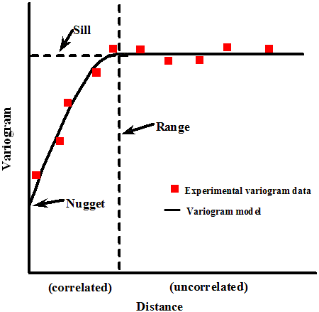
Semivariance is a measure of the degree of spatial dependence between samples. The magnitude of the semivariance between points depends on the distance between them: a smaller distance yields a smaller semivariance, and a larger distance results in a larger one.

The plot of the semivariances, as a function of distance from a point, is referred to as a semivariogram. A semivariogram shows the spatial autocorrelation of the measured sample points and displays the statistical correlation of nearby data points. As the distance increases, the likelihood of these data points being related becomes smaller. In other words: Semi-variograms take 2 sample locations and calls the distance between both points h.

When a strong spatial correlation exists, the semivariogram can help reconstruct missed values and interpolation makes reliable predictions at the unsampled locations. If data are not spatially correlated, there is no way to predict the value between measurement locations other than assigning a statistical measure (for example, arithmetic mean) to all prediction locations. As the data correlation gets stronger, fewer samples are needed for reliable data prediction and interpolation.

Typical semivariogram
Figure 2. Components of a (semi)variogram

Typical covariance function
Figure 3. Covariance

How to create a semivariogram in R:

1. Call the needed packages (We may not use all of them):

library (geoR)
library(STAT)
library(sp)

2. Call your table. Here I have converted a shapefile of Ozone measurements to a CSV. I have multiple variables in the table. Make sure that you have lat and long because we are going to base the variogram on them. (If your table does not have coordinates you can assign them randomly in Excel (or any other program) but you also need to know the rules of the coordinate system to avoid wrong coordinates)

ozone <- read.csv("E:/Ozone.csv")

3. Get the summary of distance by feeding the lat and long to the summary function. I have my lat and long on columns 20 and 21. Using the Euclidean formula manually may be practical for 2 observations but can get more complicated when measuring the distance between many observations. The dist() function simplifies this process by calculating distances between our observations (rows) using their features (columns). Remember that you can apply different types of distance calculations with dist function but here we leave it as default which is Euclidean.

dists <- dist(ozone [,20:21])
summary(dists)

Result:

Min.          1st Qu.     Median      Mean          3rd Qu.         Max.
0.006507   1.546469   2.988936    3.626425     4.146660   12.850608

Remember that we are again, making a matrix (See Part 1) of distances. you can also recall dists seeing the pairwise calculation of points which is a long table.

4. Now let’s bring the geography in. We need to convert a simple data frame into a spatial data frame object (remember that we have a CSV which is considered non-spatial).

coordinates(ozone)= ~ Long+Lat

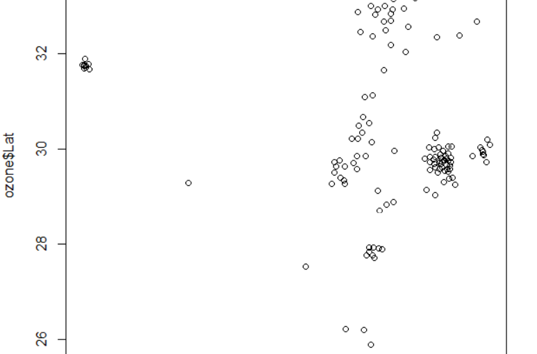
And plot the x and y:

plot (ozone$Long, ozone$Lat)

Figure 4. Coordinates plotted based on lat and long

5. Next, we create a simple variogram based on the variable storing the emission. This “bins” the data together by breaking up the distances between each of the points based on a “lag” size between the distances. The distances between pairs at which the variogram is calculated are called lags. For instance, lags may be calculated for samples that are 10 feet apart, then samples that are 20 feet apart, then 30 feet, etc. In this case, the distance between lags is 10 feet.

TheVariogram = variogram(AGE_YR_NUM~1, data=ozone)
plot (TheVariogram)

Figure 5. Semivariance without the fitting line

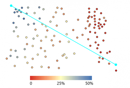
So what is the meaning of the semivariogram that we produced? What you need to know is that every point is given by the difference (variance) of a pair of samples (points) in our ozone table and the value of the emission stored in AGE_YR_NUM variable (called field in GIS). But one thing that might flee from your attention is that this variance is based on the distance. Indeed, in ArcPro if you click one of the points in your variogram you will see that a line will connect two samples as follows:

study points specific
Figure 6. Samples implementation in the variogram

Every point on the variogram will belong to a bin (category of distance). So now I may ask a question: By looking at Figure 6 and considering the sampled two points, where the variance point will fall on the variogram (Figure 5)?

  • Enter the name of the variogram in R and you’ll see a table with the following values:
  • np – number of points in the lag (bin)
  • dist – the average distance between points in the lag
  • gamma – mean for the lag

Figure 4. The variogram table in R

Note that for random data (such as the data I used) there is very little autocorrelation so the range is very small and we reach the sill quickly (we will see it for our data in the following part).

In the next part, we will finish the discussion by modeling the variogram.

ران وایات، خرافه گرائی و اکتشافاتی که هرگز رونمایی نشدند

ران وایات متولد 1933 متخصص بیهوشی و علاقه مند به باستان شناسی بر پایه داستان های کتب مقدس بود. این رشته از باستان شناسی به شبه باستان شناسی معروف است و اغلب ماجراجویانی که به دنبال اثبات داستان های کتب مقدس هستند را به خود جلب میکند

 وایات در طول زندگی خود بیش از صدو سی بار به سرزمین های مقدس  سفر کرد و قسمت بزرگی از ثروت خود را صرف جستجوی اشیاء و بازمانده های تاریخی ذکر شده درکتب دینی نمود

ron wyatt

وایات یک مسیحی اوانجلیست بود و بر واقعی بودن تمامی داستان های کتب مقدس پافشاری میکرد تا جائی که در جوانی تصمیم گرفت تا به صورت غیرحرفه ای به باستان شناسی روی بیاورد و بازمانده کشتی نوح در کوه های آرارات و صندوق عهد در اورشلیم را پیدا کند

وی به همراه فرزندان پسر خود بارها به اسرائیل سفر کرد و به حفاری در مناطق مختلف پرداخت و حتی زمانی که فرزندانش به علت بیماری مجبور به ترک وی شدند به تنهائی به کار خود ادامه داد. وایات هر گاه منابع مالی اش تمام میشد به ایالات متحده بازمیگشت تا با شغل تقریبا پر درآمد خود بتواند هزینه سفر بعدی را تامین کند

در میان مهمترین اکتشافات وایات که البته هیچ مدرکی برای اثبات وجود آن ارائه نشد میتوان از این موارد نام برد

بازمانده کشتی نوح، بازمانده خانه نوح بعد از سیلاب جهانی و قبر وی و همسرش، محل دقیق برج بابل در ترکیه، محل عبور بنی اسرائیل از دریای سرخ، محل شکافته شدن دریای سرخ توسط موسی، بازمانده ارابه های ارتش فرعون که در تعقیب قوم بنی اسرائیل بودند، بازمانده خون مسیح و صندوق عهد

باستان شناسان آکادمیک همیشه ادعاهای وایات را رد کردند. در واقع وی هیچ گاه مدرک دندان گیری برای اثبات اکتشافات خود ارائه نداد و همیشه به نقل قول بسنده کرد و یا تاکید کرد که اجازه ندارد مدارک خود را بر ملا کند. علی رغم اینکه او همیشه تاکید میکرد که برای حفاری اجازه کسب کرده است هیچ یک از ارگان های باستان شناسی اسرائیل کسب اجازه وی را تاکید نکردند

arch of covenant

در میان اکتشافات وی شاید مهمترین آنها صندوق عهد باشد.طبق کتاب خروج عهد عتیق این صندوق به دست موسی ساخته شده و حاوی ده فرمان خدا به موسی، غذائی فرستاده شده از سوی خداوند، عصای هارون و غیره بوده است و در مکانی نامعلوم پنهان است. صندوق عهد حتی با اینکه در کتب تاریخی اشاره چندانی به آن نشده ولی دراسلام هم از آن یاد شده. آیه248 سوره بقره وجود آن را تائید میکند و شیعیان اعتقاد دارند که این صندوق درزمان ظهور امام زمان به دست مهدی موعود خواهد افتاد

La guerra in Gaza raccontata da Kambiz Fattahi il reporter di BBC Persian

Kambiz Fattahi il reporter di BBC Persian nel suo viaggio nella striscia di Gaza descrive l’ultima guerra di 8 giorni tra Israele e Hamas:

Mercoledì 14 novembre stavo tornando da Israele quando ho ricevuto la notizia della morte di Ahmed Jabari, uno dei comandanti di Hamas. Mi sono rivolto al mio amico che era venuto a trovarmi dalla Germania e dissi: “Le mie ferie sono finite e la tua vacanza è terminata, da domani inizierà la guerra”.

Il giorno dopo ci siamo recati nella parte meridionale di Israele insieme alla truppa televisiva di BBC per poter entrare nella striscia di Gaza attraverso Erz. All’inizio la polizia israeliana proibiva il passaggio di giornalisti ma dopo l’intervento del portavoce dell’esercito con origini iraniane ci aprirono la strada che portava a Gaza.

Da Gerusalemme a Gaza ci vogliono solo 90 minuti per arrivare ma quello che colpisce occhio è il tenore di vita completamente diverso. Do un consiglio a tutti gli amici dicendo che se avete qualcosa da lamentare fate un salto in Gaza così dimenticherete tutti i vostri problemi. Da queste parti la popolazione è priva di ogni bene di prima necessità per vivere. La città è sovraffollata e regna il disordine. La mancanza di luce per otto ore al giorno è diventata routine. Il combustibile è caro e il mezzo di trasporto più comune è il carroccio trainato da animali.

Giovedì 15 novembre sono entrato in Gaza con un mal di stomaco forte che passò solo dopo aver visto la situazione critica della città. Gaza si era trasformata nella città dei fantasmi. Non c’erano più bambini a chiedere di dove siamo e per quale tv lavoriamo. Non c’era il traffico e neppure gli agenti di Hamas che si vestono abitualmente con la giacca scura, hanno la barba lunga e girano con i walkietalkie in mano e si spostano a bordo di macchine moderne.

Gaza si preparava per i funerali di Jabari. Le alte cariche di Hamas non partecipavano per paura di essere uccisi durante il funerale. La salma del comandante aveva subito pesanti ustioni. Sembra che Israele lo abbia ucciso con un nuovo tipo di munizioni che non causano una grande esplosione all’impatto, ma producono un intenso calore e rimangono incandescenti. In seguito abbiamo sentito che gli uffici di Al-Qods e Al-Aqsa, due tv locali, sono stati attaccati con lo stesso tipo di munizioni per non danneggiare tutto l’edificio.

I giornalisti che vivono una guerra del genere concordano sul fatto che i civili pagano un prezzo altissimo per i conflitti. Israele ribadisce sempre che i civili non vengono presi intenzionalmente sotto il fuoco, ma sono pochi in Gaza a credere in questa versione. Hamas usa i quartieri vicini alle abitazioni per lanciare i missili e l’Aeronautica di Israele non esita a bombardare tale bersaglio.

Dall’ufficio della BBC si potevano facilmente vedere i razzi palestinesi che hanno fatto suonare l’allarme in Israele. I razzi palestinesi fanno un fumo più denso accompagnato da un rumore forte. Israele risponde subito all’attacco. Due o tre minuti dopo, la zona da dove i razzi erano stati lanciati veniva bombardata dagli aerei israeliani.

Tutto questo faceva veramente paura nei primi giorni ma dopo è diventato normale. Non mi preoccupavo più di essere colpito per sbaglio anche perché era poco probabile che Hamas scegliesse un posto vicino al nostro albergo per lanciare i razzi, finché una sera lo spazio vuoto tra il nostro albergo e l’altro albergo pieno di giornalisti è stato bombardato. Tutti siamo usciti dalle camere spaventati dai bombardamenti. Una parte degli attacchi di Israele era concentrata su queste zone che secondo i palestinesi non avevano nessun peso militare e venivano bombardate con il solo scopo di spaventare la popolazione.

Dal primo giorno sembrava che Israele non avesse l’intenzione di annientare Hamas e mirasse esclusivamente a indebolire la forza bellica di questa organizzazione. Sono tanti a credere che Israele abbia bisogno Hamas per conservare una sicurezza relativa, altrimenti la striscia di Gaza cadrebbe nelle mani di fanatici come i gruppi salafiti che non esiterebbero a reagire duramente e tali movimenti vengono considerati più pericolosi per Israele.

Dopo 8 giorni di guerra con 160 vittime palestinesi e 6 israeliani, le due parti coinvolte nel conflitto accettano il cessate il fuoco con pressioni da parte degli Stati Uniti e l’Egitto. Subito dopo questa notizia le moschee hanno trasmesso i propri slogan insieme ad Allah-o-Akbar e Gaza-Gaza. Hamas dichiara la vittoria ed Israele ribatte di aver raggiunto i suoi obiettivi che comprendevano una lezione ai comandanti di Hamas, la distruzione della maggior parte delle munizioni palestinesi e la distruzione di edifici pubblici. Però tutto questo non può essere una soluzione finale per un conflitto che tra poco riemergerà. Oggi giorno né gli israeliani al sud del paese si sentono al sicuro né la striscia di Gaza è uscita dall’assedio.

Tre bambini di Mina, una madre palestinese non la vedranno più perché l’hanno persa al secondo giorno di guerra. Il figlio di Jihad Mishrawi, impiegato di BBC Arabo in Palestina è mancato sotto i bombardamenti; aveva solo 11 mesi. Le ragazzine di campo Jabalia che ci seguivano e chiedevano da dove venivamo se sono scappate dai bombardamenti, sicuramente cresceranno in un circolo vizioso di violenza che in un futuro non lontano riemergerà.

E’ consentita la riproduzione dei contenuti di questo articolo a patto che la fonte sia menzionata!

چگونگی سیاست

بعد از شناخت عاملین سیاست در این پست به شرح نحوه عمل سیاست میپردازیم. مهمترین مشخصه سیاست رفتاری بر پایه دیالوگ و اغلب بدون خشونت است. کلمه خشونت در سیاست خود به تنهائی جایگاه بحثی مفصل را دارد که در آینده به آن خواهیم پرداخت و در این مقطع به این نکته اشاره میکنیم که خشونت در سیاست فقط به رفتارهای جنگ طلبانه منتهی نمیشود و حتی تحریم های اقتصادی نیز جزئی از سیاست های خشونت آمیز به حساب می آیند

ویژگی دیگر چگونگی عمل به سیاست مقدم بودن ارزش های جمع گرانه بر فرد گرایانه است که در انتها صلاحیت زندگی جمعی را مورد تضمین قرار میدهد و به همین دلیل جنگ و رفتار جنگ طلبانه دو واژه ای هستند که به سختی در فرهنگ سیاسی به دنیای سیاست ربط داده میشوند چرا که هیچکدام  دو اصل ذکر شده در بالا را در خود جای نمیدهند. بدیهی است که بحث ما به سیاست های دموکراتیک امروزی بیشتر نزدیک است وحکومت های دیکتاتوری از این حیث در استدلال ما نمیگنجند

میتوان دو نوع از نحوه اجرای سیاست را پیش بینی کرد:اول: سیاست صلح جویانه و دوم: سیاست خشونت آمیز

قدرت: به طور حتم یکی از بزرگترین موارد مورد مطالعه در دنیای سیاست بحث قدرت است. در رابطه با نحوه اجرای سیاست باید بدانیم که قدرت در اختیار عاملین سیاست مولد اصلی اجرای سیاست است. از این نقطه نظر میتوان دو نوع دیگر از سیاست را در نظر گرفت: سیاست مشتق شده از تصمیم و سیاست بر پایه سازش

در پایان باید ذکر شود که نحوه سیاست را میتوان در پایه مشخصه های دیگر سیاست نیز تقسیم بندی کرد. برای مثال سیاست توتالیتر از نقطه نظر عاملین به سیاست  نام گذاری میشود. به همین منوال قادر خواهیم بود تا نام های مختلفی برای تشریح انواع سیاستها برگزینیم 

عاملین سیاست

 از ارسطو تا هوبز که به ترتیب چهار قرن قبل از میلاد مسیح و دیگری در عصر معاصر زندگی کرده اند هر کدام سعی در دادن مفهومی مشخص به کلمه سیاست داشته اند. از آنجائی که دانشمندان و فیلسوف ها از نقطه نظراتی گوناگون به تشریح سیاست پرداخته اند به همین علت  تعریف یگانه ای از سیاست به سختی میتواند تبلور پیدا کند. یک شرح کامل از سیاست باید قادر به پوشش دادن تمامی افق های زمانی و مکانی باشد . آن تعریفی از سیاست کار آمد است که بتواند چه در مورد یک قبیله در دور دست ترین مکان ها و چه  در مورد حکومت های فعلی در پیشرفته ترین کشورها قابل تطبیق باشد

 سیاست در ساده ترین شکل خود میتواند در قالب اخبار تلویزیون، بحث های سیاسی، تعیین خط مشی از سوی سران یک جناح و غیره به مردم ارائه شود اما بدیهی است که فقط با خطاب قرار دادن این محصولات نهائی سیاست نمیتوان تعریفی برای آن در نظر گرفت. اعلان جنگ از سوی کشوری بر علیه کشور دیگر نمیتواند سیاست قلمداد شود بلکه فقط حاصل نهائی جزئی از کلیات یک سیاست است

اگر در پی یافتن شرحی برای سیاست باشیم باید از نقطه نظر تجربی به عنوان اولین گام برای مطالعه آن قدم برداریم. معمول است که در این راه از چهار المنت اصلی برای تجزیه سیاست استفاده میشود.

چه کسی، چطور،کجا و برای چه؟

بدون شک سیاست همیشه و در همه ادوار تاریخ از سوی عاملین آن به اجرا در آمده است. سیاست آن چیزی است که سیاست مداران انجام میدهند. وِبِر مینویسد

سیاست توسط یک عده خاص که به صورت حرفه ای به آن میپردازند صورت میگیرد. کسانی که از سوی حزب ها و جناح ها انتخاب میشوند و از طریق سیاست و برای سیاست کار میکنند

بدیهی است که این تعریف کاملا منطبق بر دنیای آن روز بوده است. زمانی که فقط تعداد محدودی از مردم و آنهم غالبا فقط جنس مذکر اجازه رای دادن، دخالت در امور سیاسی و غیره را داشتند  و حتی اگر به تاریخ مدرن اروپا بنگریم سیاست فقط میتوانسته که به عده انگشت شماری تعلق داشته باشد که یا آن را از راه موروثی کسب میکردند(پادشاهی) و یا از طریق قدرتی که به آنها از طرق مختلف واگذار میشد به سیاست میپرداختند

در دنیای امروز ما فقط حق رای به عامل بودن در سیاست ختم نمیشود. هر کسی میتواند به اندازه قدرت مالی، هنری و اجتماعی خود در سیاست شرکت کند و جزئی از عاملین باشد.  یک هنرپیشه معروف، یک تاجر موفق، یک ورزشکار حرفه ای با عناوین جهانی میتواند به راحتی یکی از گزینه های مهم برای تاثیر گذاری بر سیاست باشد. نمونه آن به وفور در دنیای امروز یافت میشود: از آرنولد شوارتزنگر قهرمان پرورش اندام تا سیلویو برلوسکونی ساختمان ساز معروف ایتالیائی که با سرمایه گذاری و سود کلان در خانه سازی در طول سالهای دهه هفتاد و هشتاد قرن میلادی گذشته به ثروتی بی انتها دست یافت و سپس با به کارگیری آن ثروت در بخش رسانه های جمعی به قدرت زیادی در زمینه تاثیر گذاری بر نظر مردم دست یافت. نقطه مشترک تمامی این  افراد در آن است که هیچ کدام قبل از ورود رسمی به دنیای سیاست تجربه ای در این رابطه نداشته اند و در واقع موقعیت اجتماعی و اقتصادی ایشان راهگشای ورود به دنیای سیاست بوده است

دسته دیگری از عاملین سیاست میتوانند خانواده ها باشند. خانواده ها در طول تاریخ بزرگترین عاملین سیاست به حساب آمده اند.کافی است که برای اثبات این گفته به حکومت های موروثی تا قبل از قرن بیستم میلادی اشاره کرد تا به حضور سنگین این دسته از عاملین سیاست پی برد. ازدواج، مرگ، انتقام، تولد، حضور برجسته در انقلاب ها و روابط اقتصادی یکی از چاشنی های حضور بلند مدت خانواده ها در سیاست است. مثال های مهم این دسته از عاملین سیاست : خانواده بوش و کندی در ایالات متحده، خانواده گاندی در هند،خانواده اسد در سوریه و خاندان عبد العزیز در عربستان سعودی

تعیین نوع حضور افراد در سیاست داخلی یک کشور میتواند نوع سیاست آن کشور را مشخص کند: سیاست دموکراسی: شامل حضور همه افراد از هر طبقه ای. سیاست توتالیتر: شامل حضور سنگین عده ای محدود و نقش کم اهمیت مردم عامه در آن. سیاست تئوکراتیک: در برگیرنده حضور طبقه روحانی و ایفای نقش کلیدی آنان به مانند قرون وسطی در اروپا  و سیاست تکنوکراتیک که در حضور افراد کار آمد در راس امور هر چند در بازه زمانی کوتاه خلاصه میشود

در نوشته های آینده به ابعاد دیگر(چطور،برای چه و کجا) که برای تشریح سیاست لازمند خواهیم پرداخت